Visual Brand Identity Case Study
CLIENT
Libra Group
OUR CHALLENGE
Libra Group is a privately held international holding company. Its 20 operating entities include businesses across six continents, in six sectors: Aerospace, renewable energy, hotels and hospitality services, real estate, maritime, and diversified investments. They came to Prologue with a challenge: Create an updated visual brand that maintains a connection to the group’s history and legacy.
STRATEGY & APPROACH
Prologue was already engaged leading positioning and communications work for Libra Group. As a result, we were able to leverage existing interviews and documentation to inform the design work. Our visual work unfolded over the course of 6 weeks, and in that compressed timeframe we reviewed work on a near constant basis - e.
SCOPE OF WORK
Product: Visual Brand Identity System
Timeframe: 6 weeks
Delivery:
Logo & Visual Brand System, all assets
Brand Guidelines
Tech/Tools Used:
Adobe Creative Cloud, Figma, PowerPoint, Zoom
OUTCOMES
The identity work we did for Libra Group paved the way for a new era of growth and leadership for the firm. The new brand enabled them to be more unified in their communications while still highlighting the diverse industries they work in.

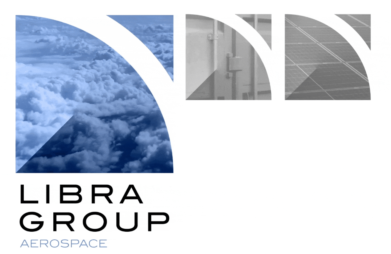
NEW LOGO
Our Process & Work


In our concept phase, we lead Senior Leadership through an exercise that helped define the unique and own able position that Libra Group aspires to, as well as what elements of their organizational strategy could serve as pillars for our visual brand work.
The three areas we defined together were Responsibility, Growth and Innovation. We used these three pillars as a foundation for exploring logo work.

Emphasize responsibility, growth and innovation.
We built a mark that draws from three main areas of interest defined in our concept and strategy working sessions.
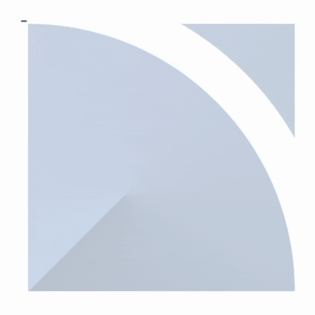
Responsibility=Blue Planet
Calls to mind the land, seas and
skies. Also represents the global
nature of the brand and its group
ecosystem.
+
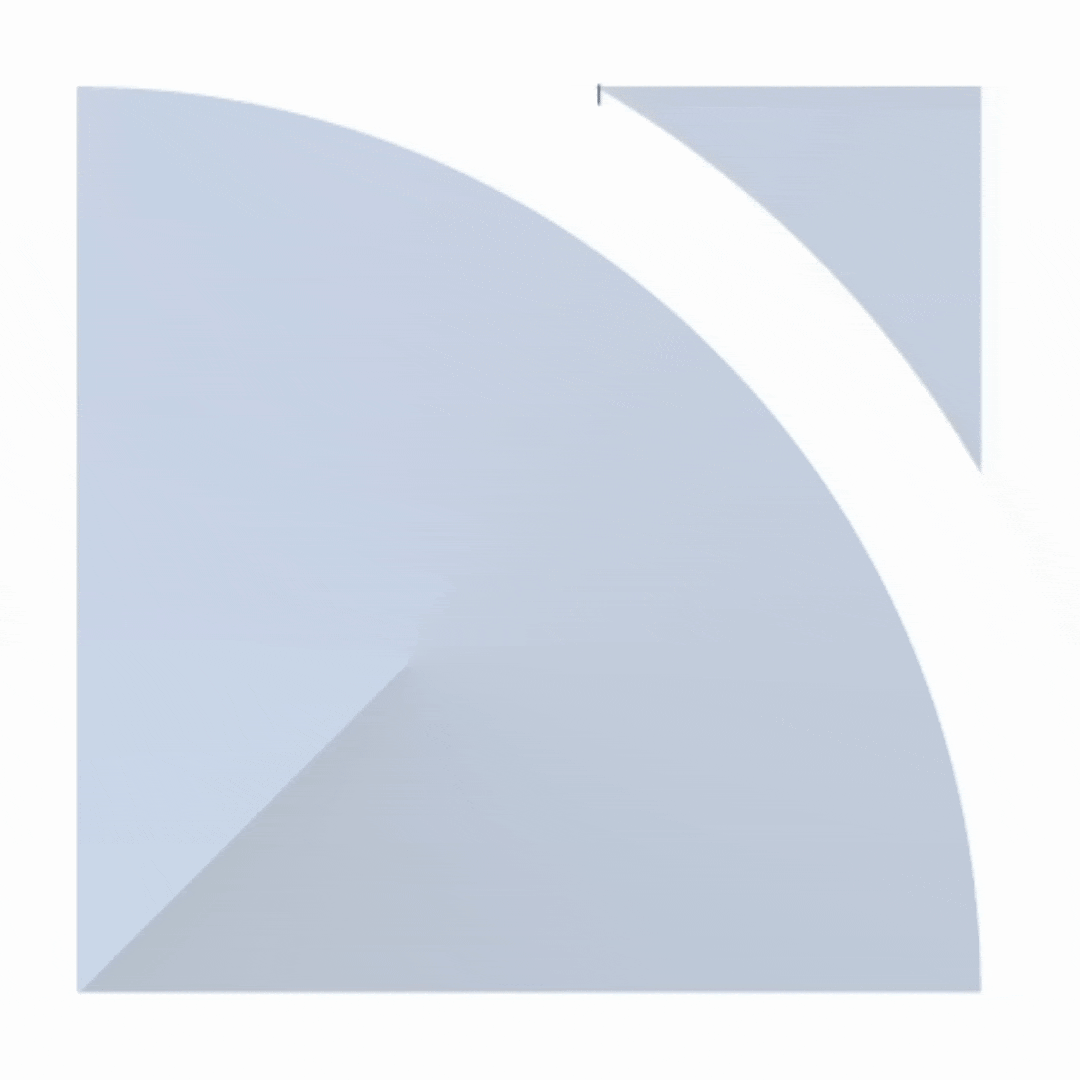
Innovation=Arrow
Pointing upwards, like an aircraft
flying over the surface; representing
aspiration for growth innovation and
the possibility of a better world for all.
+
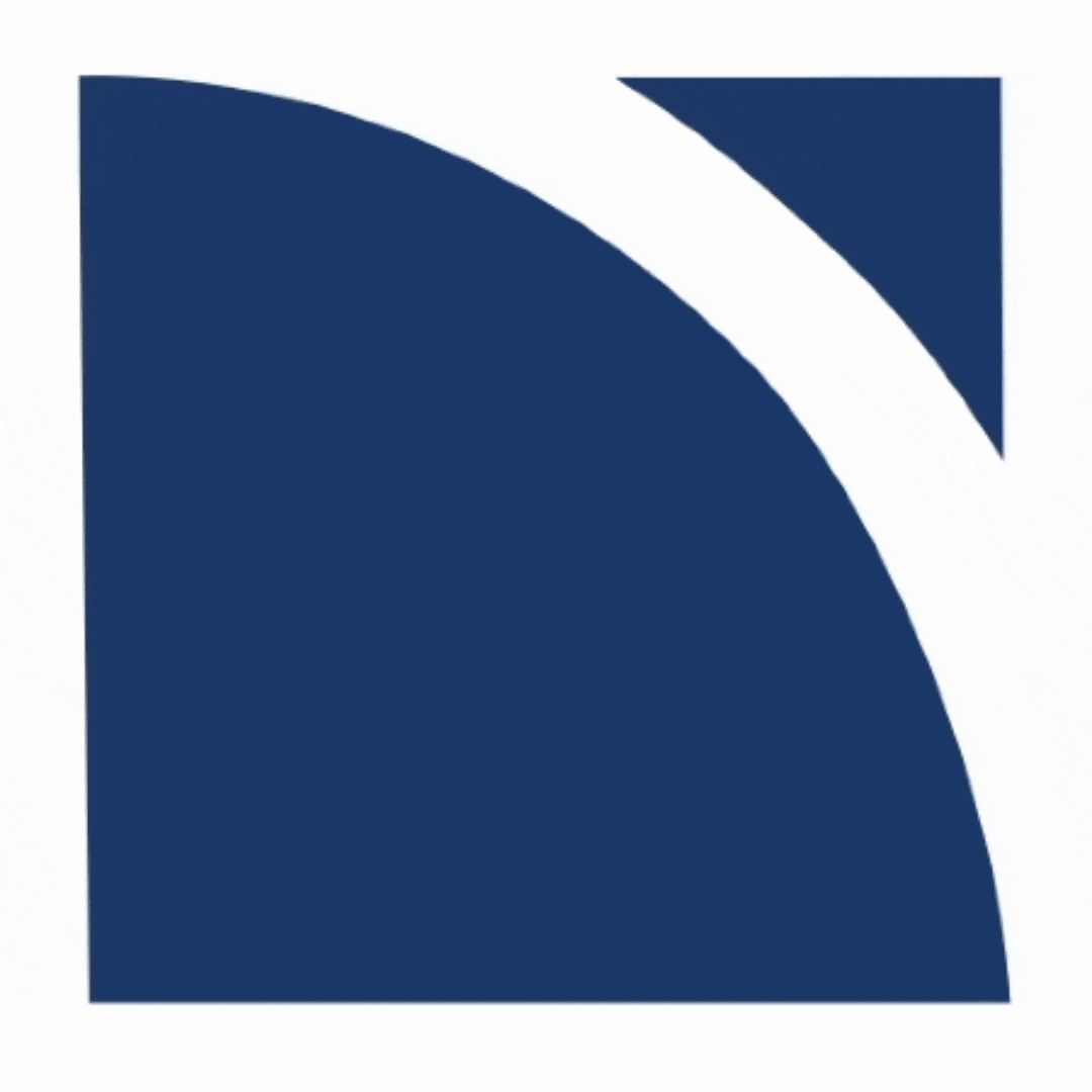
Growth=Roots
Fading from the Greek blue and
shifts in hue to a richer, more
globally positioned value.

The logo’s clean, bold qualities allow it to take on multiple treatments while remaining memorable and ownable.

We developed logo skins that correspond to specific industries or subject matters under the brand. The logo remains recognizable and readable at micro and massive scales.
A Point of View on Stock Photography
Given the broad range of industry expertise within Libra Group, the brand needed a large image library. We were tasked with developing a point of view for the brand that gave them flexibility to visualize different areas of focus while still looking and feeling like Libra.

We suggested that utilizing abstract vantage points or cropping in on imagery would help reduce the “stock” like quality to the images, and also give them more flexibility in how and where they used them.


We provided a color range to look for in choosing images. We wanted the images to always complement the new brand colors which were all hues of blue. We suggested using imagery the skewed cool, but had hints of complimentary desaturated colors like rust reds, burnt oranges and mustard yellows.

Whenever possible, we recommended that images of nature be interspersed with the more abstract takes on the various industries they worked in. We wanted to ensure that their use of photography would not only depict the work they do, but its impact as well.


